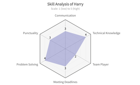
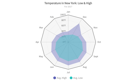
Consider radar charts/ spyder graph for a clear grasp of multifaceted data. Often called spider or web charts, they transform information into an intuitive web-like image. This dynamic visualization chart showcases comparisons between multiple variables, making it a valuable tool for performance analysis, product comparisons, and strategic planning.
What are Radar or Spider charts?
A radar chart is a graphical method of displaying multivariate data in the form of a two-dimensional chart of three or more quantitative variables represented on axes starting from the same point. The relative position and angle of the axes is typically uninformative.
What is the purpose of the spider chart?
Spider charts/spyder graph, also known as radar charts, serve a unique and valuable purpose in data visualization by providing a comprehensive view of multivariate data. Here are the key purposes of using spider charts:
Comparing Multiple Variables
Spider charts allow for comparing multiple variables simultaneously, offering a comprehensive data view.
Highlighting Strengths and Weaknesses
These charts highlight strengths and weaknesses, aiding in performance reviews and product analyses.
Benchmarking and Comparison
Spider charts compare different entities and benchmark against industry standards.
Enhancing Presentations and Reports
Their visually appealing design makes spider charts ideal for enhancing presentations and reports.
Simplifying Complex Data
Spider charts present complex data in a simple, easy-to-read format.
Start Using Spider Charts Today!
Transform your data analysis and presentations with spider charts. Easily compare variables, spot patterns, and highlight strengths and weaknesses. Enhance decision-making, benchmark against competitors, and simplify complex data. Begin using spider charts now with FusionCharts to gain deeper insights and communicate effectively!

